Fran@studiofgraphics.com
Fran@studiofgraphics.com

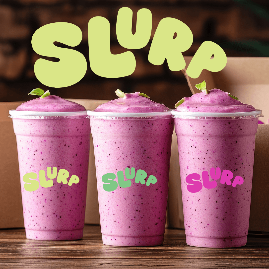
Slurp Smoothies
Slurp is a smoothie brand identity built to feel fresh, energetic, and full of personality. I wanted it to stand out through bold colour, playful illustration, and a sense of movement that reflects the swirl of blended fruit. The visuals use bright, juicy tones and fluid shapes inspired by pouring and mixing, giving each flavour its own distinct feel. The typography is rounded and friendly, keeping the tone fun and approachable while adding a sense of rhythm and flow. Packaging and promos are bold and easy to read, using simple fruit graphics and confident layouts to show flavour quickly. Overall, it’s a youthful, lively identity that turns something simple into a fun, memorable experience.
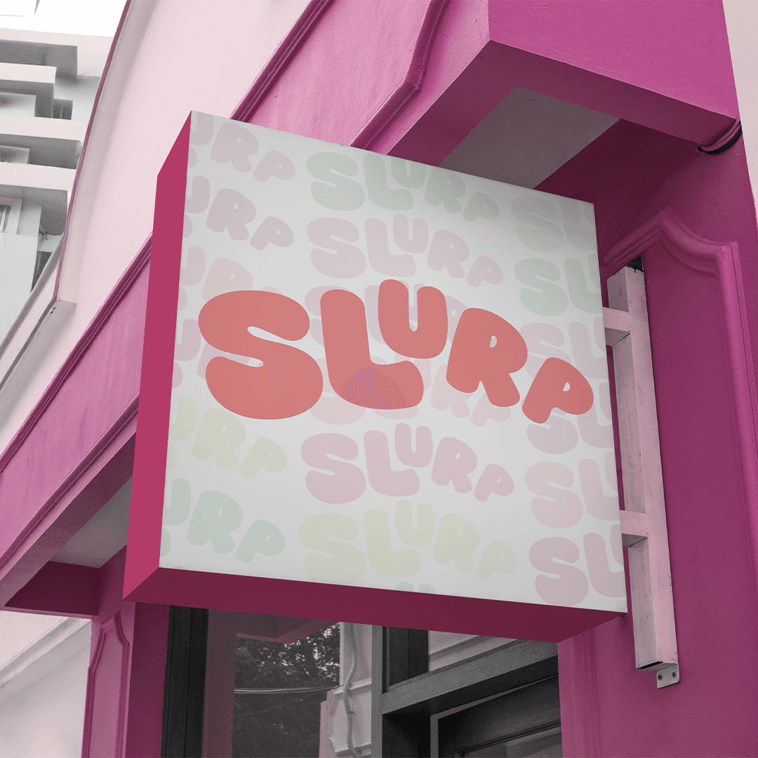
Brand Identity
Motion Graphics
Packaging
Logo Design
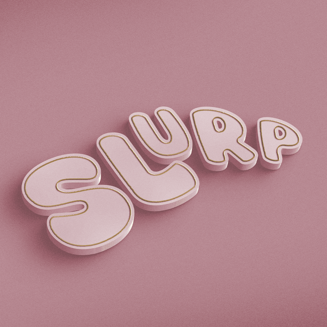